


Researchers that collect quantitative, or numerically based, data implement various forms of statistical analysis methodologies to derive conclusions from this data. By seeking relationships between different data sets they accumulate, researchers can assess hypotheses about how different factors affect one another, and illustrate how strong these effects are. One such method entails testing for statistical correlations.
Correlations
Correlation measures the relationship between two variables. Correlations are a simple form of statistical analysis that looks for numerical relationships between two equally sized data sets. By comparing numbers from two different data sets together, correlations look at how movement in the value of numbers in one data set is related to movement in the value of numbers in the other data set. The purpose of doing correlations is therefore to allow researchers to make a prediction about one variable based on what is known about another variable.
For example, it is known that there is a correlation between income and education. We find that people with higher income have more years of education. (One can also phrase this as people with more years of education have higher income). When it is observed that there is a correlation between these two variables, it enables one to make a prediction. If a group’s income is known, for example, then their years of education can be calculated.
Types of Correlation
Now that correlation has been defined (in a basic sense) as a relationship between two variables of a data set, it would be illustrative to introduce the concept of a scatter plot as a visual representation of the data. Scatter plots are constructed by displaying two variables of the data set using Cartesian Coordinates. The data is displayed as a collection of points, each having the value of one variable determining the position on the horizontal axis and the value of the other variable determining the position on the vertical axis. This kind of plot is also called a scatter chart, scattergram, scatter diagram, or scatter graph, and will often show at a glance whether a relationship exists between the two variables. For example, in the scatter plot shown below, each dot represents one person’s weight versus their height.
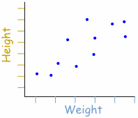
The data displayed on the graph resembles a line rising from left to right. Since the slope of the line is positive, there is a positive correlation between the two sets of data. This means that according to this set of data, the greater the weight of a person, the greater the height in general.
The correlated variables can move in the same direction or they can move in opposite directions. This leads to the concept of correlation type. Broadly speaking, correlations can be classified into seven types as follows:
(1) Positive Correlation
(2) Negative Correlation
(3) Strong Correlation
(4) Weak Correlation
(5) Zero Correlation
(6) Perfectly Positive Correlation
(7) Perfectly Negative Correlation
The following sections describe the types of correlations, with examples provided wherever possible.
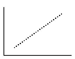
Positive Correlation
When two variables move in the same direction, then the correlation between these two variables is said to be positive. Positive correlation occurs when an increase in the value of one variable leads to an increase in the value in the other. The line corresponding to the scatter plot is an increasing line, as shown in the figure below.
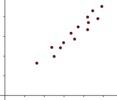
An example of positive correlation could be the relationship between the amount of training received, and the performance of employees in a company.
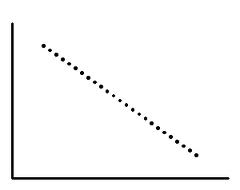
Negative Correlation
Negative correlation occurs when an increase in the value of one variable leads to a decrease in the value of the other. The line corresponding to the scatter plot is a decreasing line. In this type of correlation, the two variables move in opposite directions to each other.
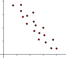
The relationship between the price of a product and the demand for it illustrates an example of negative correlation.
Strong Correlation
A correlation is said to be stronger the closer the points in the scatter plot are located to one another along a straight line.
Weak Correlation
A correlation is said to be weaker the farther apart the points are located to one another along a straight line.

Zero Correlation
When the two variables are independent and the change in one variable has no effect on the other variable, then the correlation between these two variables is known as Zero Correlation. In zero correlations, there is either a) no meaningful relationship between the two variables (the association is a random one) or b) the relationship is other than linear (i.e., a curvilinear relationship). As we shall see in a later section, this implies a correlation coefficient equal to 0.
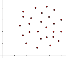
An example of zero correlation is when two or more investments in a portfolio show no relationship to each other. Combining multiple assets with no correlation would be an ideal diversified portfolio because volatility (risk) of the whole portfolio would theoretically be minimized. In the real world, however, most assets are correlated to each other, so assets with a very weak correlation such as Gold and Stocks could be considered as a good example of non-correlated assets. Another example could be the relationship between weight and intelligence.
Perfectly Positive Correlation
When a change in one variable, say x, always induces a change in the other variable, say y, in the same direction, then these two variables are said to have a Perfectly Positive Correlation. A perfectly positive correlation means that for 100% of the time, the relationship that appears to exist between two variables is positive. In this case all the points on the scatter plot lie on a straight line.
As we shall see later, a perfect positive correlation corresponds to a correlation co-efficient of +1, and indicates that as one variable moves, either up or down, the other variable will move in lockstep in the same direction.
Perfectly Negative Correlation
When the relationship between two variables x and y is such that a change in x always induces causes a change in y in the opposite direction, then this correlation is called a Perfectly Negative Correlation. A perfectly negative correlation means that the relationship that appears to exist between two variables is negative 100% of the time.
In this case, too, all the points on the scatter plot lie on a straight line. A perfect negative correlation implies a correlation co-efficient of -1, and indicates that as one variable moves, either up or down, the other variable will move in lockstep in the opposite direction.
Perfect correlations occur when there is a linear relationship between the variables. A textbook example of two perfectly correlated variables x and y is when the relationship between the two is of the form y=mx+c (which is the equation of a straight line). In this case, a positive or negative value of the slope m of the line would result in a perfectly positive or negative correlation respectively between x and y.
Obviously, the relationship between the two variables need not be linear. Although these nonlinear relationships are worthy of note, they cannot be construed in the same way as with a linear (straight-line) relationship and the corresponding treatment of such associations.
The next sections will describe the advantages and disadvantages of the correlation methodology.
Advantages
An advantage of the correlation method is that it can enable researchers to make predictions about outcomes when they know about correlations. If two variables are strongly correlated, it may be possible to draw conclusions regarding one variable based on the other. For example, a researcher could look at correlations between the frequency of police patrols in a particular neighbourhood and the crime rate in order to understand whether there is a relationship between the two. A further benefit of the correlation method is that it expedites the path to further research by other professionals in the field. Correlational research provides a good initial basis for the exploration of an event or association. This, in turn, permits researchers to determine the extent and course of a relationship so that later analyses can fine-tune the outcomes and, if feasible, establish causation experimentally. Thus, for wide-ranging but still important observations, correlative explanations can offer a significant understanding regarding relationships between variables.
Disadvantages
The principal drawback of correlations is that while they are able to convey the nature of relationships between data sets, they can offer no indication as to causality. Unfortunately, the calculations underlying the correlation equations do not allow scholars to identify which data set is accountable for the explanation of the relationship between the variables in a data set. In the instance of running a correlation between the number of hours spent studying and test scores, it may perhaps be natural to reason that a positive correlation between the two variables exists owing to the number of hours spent studying. Nonetheless, as far as the mathematics behind the correlation equation is involved, there is no method of proving that the opposite, namely, that attaining higher test scores causes one to study more, is not correct. This is because correlations are essentially bivariate in nature: they only tend to find associations between two numbers at a time from two separate data sets. However, this methodology merely permits researchers to explore relationships involving two factors at a time. Nevertheless, this is not representative of the fact that there are almost always several relationships that influence an event. In the case that a researcher sought to study interrelated associations and outcomes, the correlation equation is statistically unable to adapt to such a research strategy. Regression analysis, however, lets a researcher to not only ascertain causality but also to study relationships involving more than two data sets.
In conclusion, a correlation only discloses a relationship; it cannot offer a categorical basis for why a relationship exists. A correlative result does not uncover which variable has a prominent influence over the other. For example, a strong correlation between wealth and education does not clarify whether having wealth leads to more education, or whether having an education leads to more wealth. No causes for either can be presupposed, but until more investigation is completed, causation cannot be ascertained. Moreover, it is possible that a third, unidentified variable might be the underlying cause affecting both these phenomena. For instance, residing in the state of New York could as well lead to both wealth and education.
Therefore, it is of utmost importance to be vigilant when interpreting correlations, especially where new disciplines are concerned. This has led to the by now popular refrain that “Correlation does not necessarily mean Causation.” A strong correlation between data does not automatically indicate that one set of data is producing the effect that is cropping up in the other set of data. For example, there may be a high correlation between the absorption rate of a prescribed medication by patients belonging to a particular age group in Hospital A, and the blood pressures of patients in the same age group in Hospital B. So does this mean that the procedures followed on patients in Hospital A has an effect on patients in Hospital B? Of course not! One should always be cautious what inference one draws from correlational statistical analyses. It should be ascertained that the relationship is logical. In addition, it is a good idea to keep in mind that other factors may be involved in a cause-effect relationship.
Subsequent parts will explore methods of quantifying correlation.
- Ranking of Top Data Scientists on Twitter using MajesticSEO’s Metrics - August 19, 2014
- Measuring Twitter Profile Quality - August 14, 2014
- PageRank, TrustFlow and the Search Universe - July 7, 2014
By the way, Udacity is offering free introduction course into statistics. So if some of you are interested in learning how to use advanced statistics… might be very usefull for data analysis.
https://www.udacity.com/course/st095
April 18, 2013 at 2:06 pmGood post on correlation. Thanks
April 21, 2013 at 11:01 amThanks, this is usefull post for me and beginners.
May 8, 2013 at 4:01 pm